
What going out with my four-year-old taught me about UX
Going out with a child has a way of making you notice things you never thought twice about before.
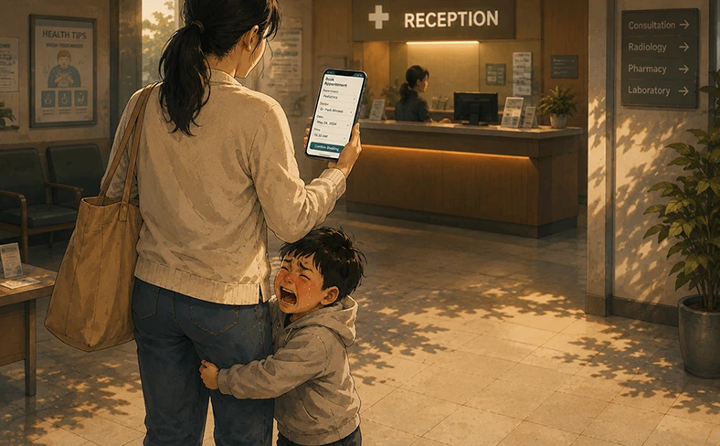
Not long ago, I was walking into a café with my four-year-old. I had a bag in one hand and was holding my child’s hand with the other.
In front of us was a heavy door.
Normally, I would have opened it without thinking. But this time, I had to let go of my child’s hand, adjust my bag, open the door, and then make sure my child followed safely behind me.
The door hadn’t changed.
What changed was the context in which I was using it.
The same user, a different context
As a UX designer, this small experience made me think. We often design around the “user.” But the same person can have a completely different experience depending on the context in which they’re using a product.
- Using a phone with two hands versus holding a child’s hand with one.
- Making a payment somewhere quiet versus doing it while talking to your child.
- Having plenty of time versus trying to get something done quickly.
The user hasn’t changed. Their context has.
Inclusive Design describes these kinds of experiences as situational limitations. Microsoft’s Inclusive Design framework gives a particularly relatable example. A person who has the use of one arm, someone with a temporary wrist injury, and a new parent holding a child may all experience a similar need to interact one-handed. Microsoft describes this spectrum of permanent, temporary and situational constraints through its Persona Spectrum.
Designing for real life
This made me think about how often we design for ideal conditions. We imagine a user who is focused, sitting comfortably, with both hands available and enough time to complete what they’re doing. But real life rarely looks like that.
Someone might be checking an appointment while walking, making a payment while holding a child’s hand, or returning to a form after being interrupted. These aren’t unusual edge cases. They’re everyday situations.
Think about a mobile checkout. On a large phone, placing the primary “Continue” or “Pay” action at the top of the screen may work perfectly well when the user has both hands available. But for someone holding a child, a bag or even a cup of coffee, that same action can suddenly become difficult to reach.
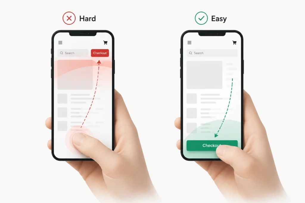
Keeping key actions within a comfortable thumb zone is a small design decision, but one that can make the experience easier across many different situations.
It shifts the question from simply:
Can the user use this feature? to Is it still easy to use in the context of their everyday life?
How to design for context
Before calling a flow finished, it can be useful to ask:
- Can it be completed comfortably with one hand?
- Can users recover easily if they make a mistake?
- Can someone return after an interruption and quickly understand where they left off?
- Are the most important actions still obvious when the user is distracted or in a hurry?
These are small questions, but they help move our thinking beyond an ideal user in an ideal environment.
Context is part of the experience
Becoming a parent didn’t suddenly make bad design appear everywhere. The doors were already there. The interfaces were already there. I simply started experiencing the same designs in different circumstances, which has made me think more carefully about context when designing digital experiences, because our users aren’t always sitting in ideal conditions, fully focused on the interface we’ve designed. They’re moving, multitasking, carrying things, being interrupted, and taking care of other people.
They’re living their lives.
Good UX starts with understanding the user.
Great UX also understands the situation they’re in.
Reference: Microsoft Inclusive Design: Inclusive 101 Guidebook
Want to create digital experiences that work better for people in real-world situations?
Get in touch with our team to discuss how we can help.