Building age-inclusive digital experiences
Challenging the myth of the “technically inept Boomer”
Many of us have seen an older person struggle with a smartphone, often followed by the assumption that Boomers “just don’t get technology.” It’s an easy stereotype, but it misses an important truth. Boomers adapted to decades of technological change, from complex machinery and early computers to home electronics long before touchscreens existed. Their difficulty with modern interfaces is not a lack of ability. It reflects a shift in how technology now communicates with its users.
Today’s touch interfaces rely on gestures, symbols and hidden interactions that were never part of the systems Boomers learned to use. Younger users absorb these conventions through exploration, while Boomers approach technology with mental models shaped by physical feedback and visible controls. When modern design fails to account for this difference, frustration is inevitable. These struggles are not personal failings. They are the result of design choices that make many interfaces harder to use than they need to be, and a reminder that more inclusive design benefits everyone.
The overlooked digital divide

The real digital divide for late Boomers is not access to devices. It is the shift from physical controls to flat glass screens.
For decades, technology communicated through touch and movement. Buttons clicked. Dials turned. Switches flipped. These physical signals confirmed actions and reassured users that something had happened. Boomers learned technology through these clear, mechanical interactions.
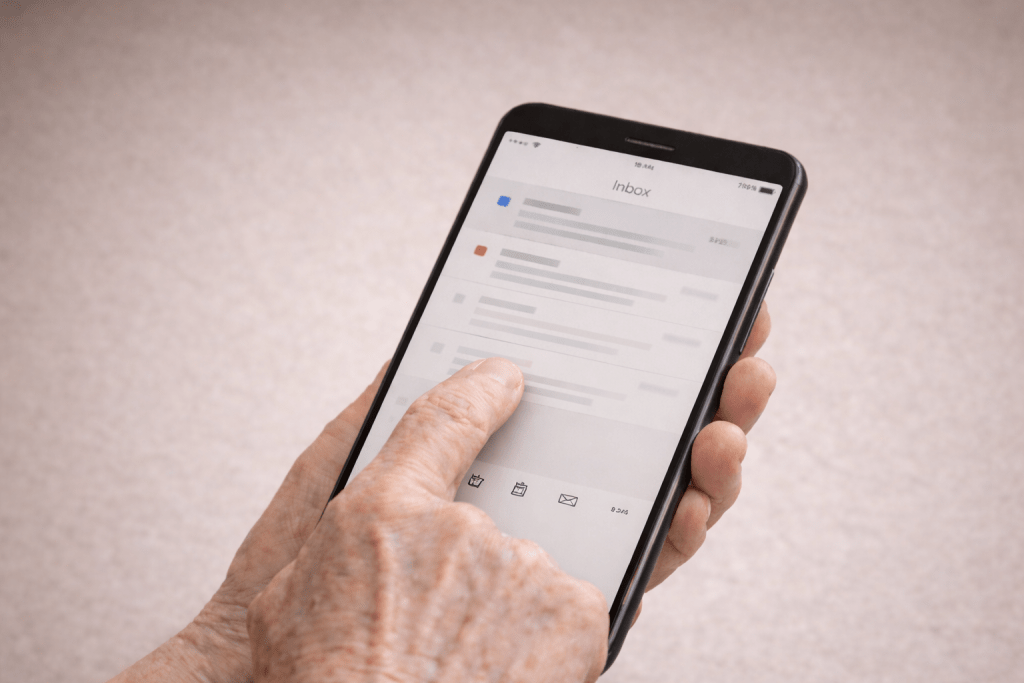
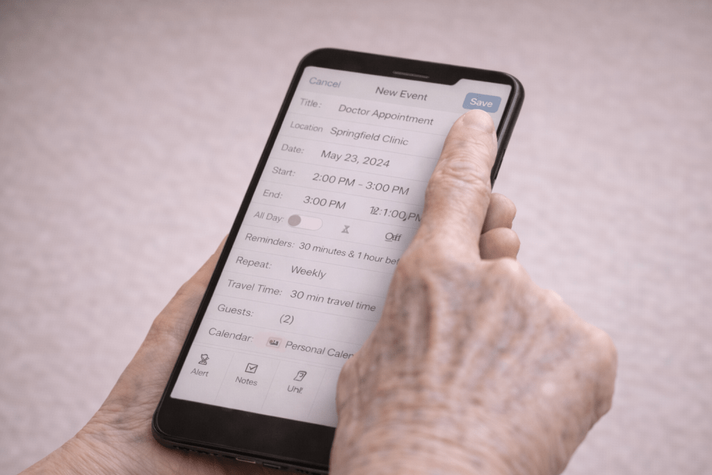
Touchscreens removed all of that. Every part of the surface feels identical. Nothing moves, clicks or resists. Instead of physical cues, users must rely on abstract icons and gestures to understand what to do.
Younger people adapt easily because they grew up with these conventions. Boomers did not. Their mental models were shaped by machines that behaved predictably and signalled their purpose through form and feedback.
On a touchscreen, those signals disappear. A tap might open, close or delete something depending on context. A swipe might reveal options or remove content. For someone who expects physical guidance, this can feel like guesswork.
The divide is not about intelligence or willingness to learn. It is about expectations formed by different eras of technology. Recognising this helps explain why touchscreens often feel unintuitive to older adults and why clearer, more grounded design is essential.
The key challenges Boomers face with touch interfaces
Loss of physical feedback
Boomers are used to technology that responds through touch. Physical controls confirm actions: a button depresses, a knob turns, a lever moves.
Touchscreens provide none of this reassurance. A tap feels the same whether it succeeds or fails. There is no tactile cue to guide the hand, no sense of depth or movement to anchor the action. If nothing happens, the user is left wondering whether they pressed incorrectly or the device simply did not register the input.
This absence of feedback creates hesitation and uncertainty. Users repeat actions, press too lightly or too firmly, or avoid interaction altogether. Tasks that should feel simple become stressful because the interface offers no confirmation.
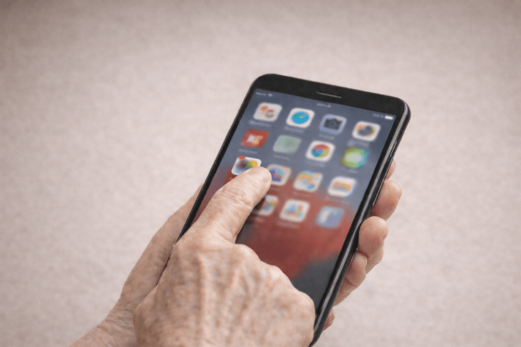
Visual overload and tiny touch targets
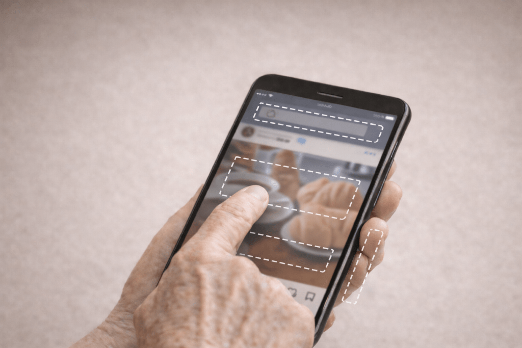
Modern interfaces pack large amounts of information into small spaces. Icons are small, text is thin and controls are often placed close together. For Boomers, whose eyesight and fine motor control may naturally be degrading, this design can be particularly challenging.
Low contrast colour schemes and minimalist aesthetics may look elegant, but they reduce legibility. Small touch targets increase the chance of mis-taps. The result is frustration, mistakes and a growing fear of “doing something wrong.”
These choices also increase cognitive load. Instead of focusing on the task, users must concentrate on deciphering the screen. The problem is not that Boomers cannot operate devices. It is that many interfaces prioritise visual style over functional clarity.
Gesture ambiguity
Modern apps rely heavily on gestures such as swiping, pinching and long pressing. Yet these actions offer no visible clues. A swipe might delete an email, reveal a menu or simply scroll the page. A long press might open options, or do nothing at all.
Because gestures look identical at the start, timing becomes confusing. Hold a tap slightly too long and something unexpected happens. This unpredictability makes interfaces feel risky and discourages experimentation.
Many Boomers avoid gestures entirely and search for clear on-screen controls. But as apps increasingly hide functions behind gestures, even simple tasks become harder. The issue is not reluctance to learn; It is the lack of clear signposts and consistent behaviour.
Cognitive overload from layered navigation
Modern apps frequently bury controls behind icons, sub-menus and hidden panels. Instead of focusing on their goal, users must first work out how the interface is structured.
When every app organises options differently, people are forced to rebuild their understanding again and again. This constant adjustment is exhausting, particularly for those who expect controls to be visible and predictable.
The core problem is not the user. It is navigation systems that feel like puzzles rather than tools.
These struggles are not a personal failing
It is tempting to assume Boomers struggle with touchscreens because they are resistant to change. In reality, their difficulties highlight weaknesses in modern interface design.
Touch interfaces depend on abstract symbols, hidden actions and conventions learned only through long exposure. Boomers mastered complex technologies long before smartphones existed, yet they are blamed when unclear design leads to confusion.
When large numbers of people struggle with the same tasks, the problem is not the user. It is the interface. Good design should guide people of all ages, not demand specialised digital intuition.
The real culprit: Shortcomings in modern ux design
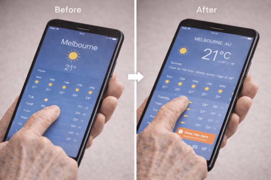
Many current design patterns favour aesthetics or novelty over clarity. Interfaces rely on hidden gestures, abstract icons and frequent layout changes. These choices make technology feel less reliable and more intimidating.
Inconsistency across apps adds to the problem. An action that works one way in one app may behave differently in another, forcing users to relearn basic tasks.
These issues reveal a design culture that assumes all users share the same background knowledge. When interfaces depend on unspoken rules, they disadvantage anyone who did not grow up with those conventions.
Common design problems that create barriers
Invisible interaction models
- Heavy reliance on gestures without visual cues.
- Poor discoverability of functions
- Interfaces that feel unpredictable
Minimalism prioritised over usability
- Removal of visible controls for the sake of “clean design”
- Icon-only buttons with no labels
- Reduced clarity in everyday tasks
Accessibility considered too late
- Tiny touch targets
- Low contrast colour schemes
- Default settings unsuitable for older users
Inconsistent behaviour across apps and devices
- The same gesture producing different outcomes
- Lack of standardisation
- Constant disruption of mental models
Frequent and unannounced layout changes
- Updates that arrive without explanation
- Users forced to relearn familiar actions
Lack of older adults in ux testing

- Design and research conducted mostly with younger participants
- Older adults rarely included in early feedback loops
The problem with icons
Icons are meant to act as quick visual shortcuts. Instead of reading a label, users can recognise a symbol and understand what it does. In many modern interfaces, icons have replaced text entirely and are used to represent everything from navigation to settings to hidden menus. This approach aims to make screens cleaner and use the available screen area more efficiently, but it also introduces a layer of ambiguity.
The challenge is that icons are not a universal language. Their meaning depends on familiarity, cultural context and previous experience with digital systems. A symbol that seems obvious to a younger user may be unclear or misleading to someone who has not grown up interpreting abstract shapes on a screen. When icons stand in for important actions without explanation, they force users to guess what they do¹.
This reliance on symbols creates confusion for many Boomers, not because they lack ability, but because the interface expects them to already know what each image represents. When meaning is not obvious, icons become obstacles rather than aids.
Icons are not a universal language
There is a widespread assumption that users automatically understand symbols, yet research shows that icon effectiveness depends heavily on familiarity and semantic clarity². When an icon does not clearly map to a known object or action, users must pause to interpret it, increasing cognitive load.
A lack of consistency makes this worse. An icon used for a particular action in one app may represent something completely different in another³. This forces users to relearn meaning repeatedly, undermining confidence.
Icons have become highly abstract
Over time, icon design has shifted from literal imagery to highly stylised minimal shapes. While this trend supports a cleaner aesthetic, it often removes the real-world cues that make icons intuitive¹. As icons become more generic and symbolic, their meanings become harder to infer without prior knowledge.
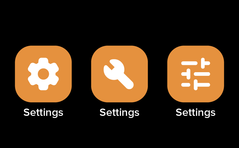
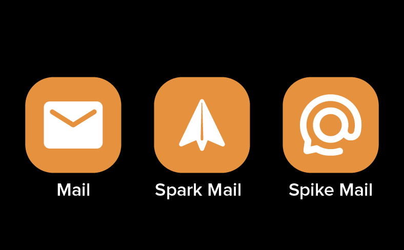
Icons often look too similar
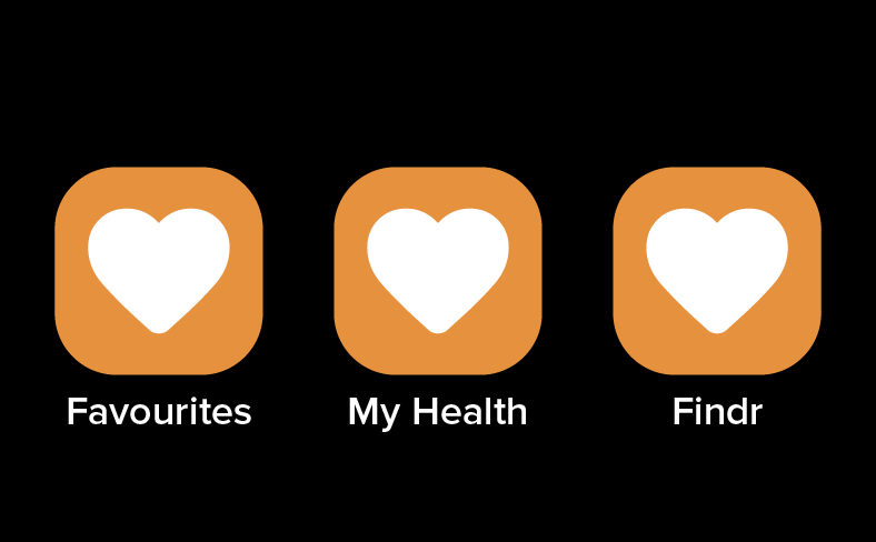
Visual sameness between icons is a common problem. Designers frequently adopt uniform line weights, shapes and styles to create a cohesive look, but this can make different actions appear almost identical⁴. When icons are too similar, users rely on memory rather than recognition, increasing the likelihood of mistakes.
Identical icons can even perform unrelated actions across apps, creating a sense of unpredictability and eroding trust in the interface⁴.
Hidden meanings and vague symbols
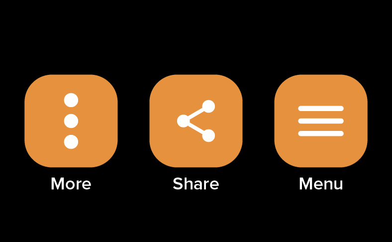
Many modern icons lack any clear real-world reference. Symbols such as the three-dot menu or generic share arrow often have no obvious meaning outside digital contexts³. This creates apprehension about the consequences of tapping them and discourages exploration.
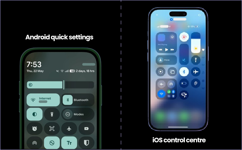
Icons vary across platforms and apps
Lack of standardisation remains a major usability issue. The same concept may be represented by entirely different icons depending on the platform or application⁴. Users, especially older ones, struggle when familiar symbols suddenly change or behave in unexpected ways.
Overuse of icon-only interfaces
The removal of text labels in favour of icon-only toolbars is increasingly common. However, usability research consistently shows that unlabelled icons reduce efficiency and increase error rates⁵. Without textual support, users must guess at meaning, which leads to hesitation and anxiety.
Icons ignore the literacy strengths of older adults
Written language is often far more effective for Boomers than abstract imagery. Decades of experience reading and interpreting text are undermined when interfaces replace clear words with cryptic symbols. Established usability principles recommend pairing icons with labels whenever possible⁶.
Confusing icons undermine confidence
When icons are unclear, users become hesitant and cautious. Mistakes feel more likely, and the perception grows that they are not competent with technology, even when the real issue is poor design. This loss of confidence is one of the most damaging side effects of modern icon-heavy interfaces.
Closing reflection
Touchscreens have become central to daily life, yet they are often designed for a narrow slice of users. When interfaces rely on hidden gestures, ambiguous icons and constantly shifting layouts, they make technology harder than it needs to be.
Boomers feel this most strongly because these patterns conflict with the way they learned to use tools but the shortcomings affect everyone. Good design should not demand constant adaptation. It should guide, support and reassure.
As our population ages, inclusive design is no longer optional. It is essential. Small improvements in clarity and consistency can make technology more approachable, more humane and more effective for all users, not just the youngest and most tech-fluent.
At SRC Innovations, we design and build digital interfaces to be accessible by default, not as an afterthought. We believe great user experiences should be clear, inclusive and usable by everyone, regardless of age, ability or technical confidence.
If you’d like to discuss your accessibility or interface design requirements, get in touch with our team.
Bibliography
- Nguedia-Adele, A. (2023). Iconography in UI/UX Design. Available at: https://nguediaadele.com/iconography-in-ui-ux-design/
- Huang, S., Chen, Y., & Lin, C. (2022). Semantic concreteness and icon interpretability: Effects on user comprehension and performance. Displays, 74, Article 102256. Available at: https://www.sciencedirect.com/science/article/pii/S0141938222001093
- Muzli. (2018). Why Your Icons Are Confusing Users and How to Fix Them. Available at: https://medium.muz.li/why-your-icons-are-confusing-users-and-how-to-fix-them-738dec6d8ddc
- Icon Design Lab. (2018). 10 Mistakes in Icon Design That Confuse Users. Available at: https://blog.icondesignlab.com/en/2018/10-mistakes-in-icon-design-that-confuse-users/
- UX Planet. (2017). Unlabeled Icons: Sacrificing Usability to Look Pretty. Available at: https://uxplanet.org/unlabeled-icons-sacrificing-usability-to-look-pretty-415408a0e115
- Nielsen Norman Group. (2014). Icon Usability. Available at: https://www.nngroup.com/articles/icon-usability/